The Library: Reveal
The Opening
Although still requiring final touches, such as some interior furnishings and outside landscaping (and famous Word of Life mural), Memorial Library opened its doors at the beginning of the academic year, September 18, 1963. Most of the library was accessible at that point, except for three floors of the tower, which were left untouched and would sit unfurnished until there were enough books to fill them. Father Hesburgh said in 1982, at a time when the library had well over one million volumes, "I won't rest, or I probably won't be around when that happens, but I'd like to see it all full." In fact he did live to see it reach 2 million volumes, by the library's 30th anniversary, about ten years later.
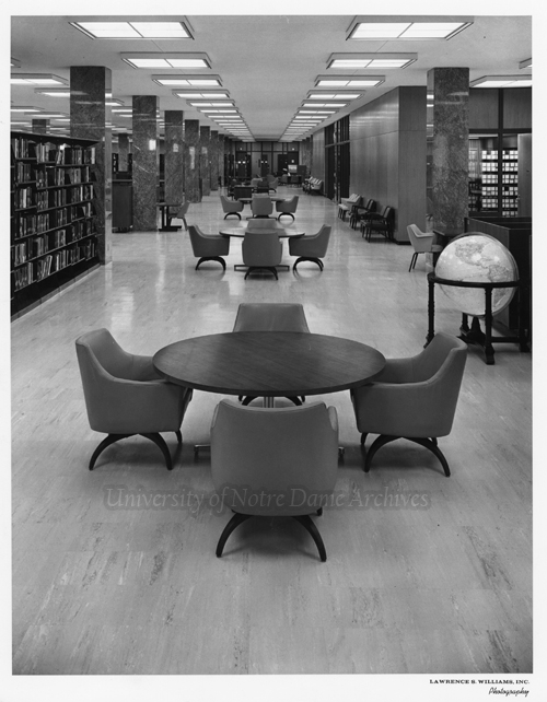
The new Memorial Library had an open floor plan, with a large basement and first floor, and even larger second floor, creating an overhang supported by columns around the exterior of the ground floor. Fewer interior walls meant there could be open stacks for greater accessibility to books and a convenient card catalog, the precursor of the online catalog. The first two floors were designed as the College Library for mostly undergraduate use, and eleven floors above as the Research Tower for graduate students and researchers. Areas of the library not taken up by the stacks or seating, contained smaller reading rooms, offices, and conference rooms for faculty and staff, and groups of semi-private study carrels for students. The library also included an auditorium, typing room, Audio Learning Center with cutting-edge equipment, rare book room, Medieval Institute, Soviet and Eastern European Studies Center, Jacques Maritain Center, and the University Archives.
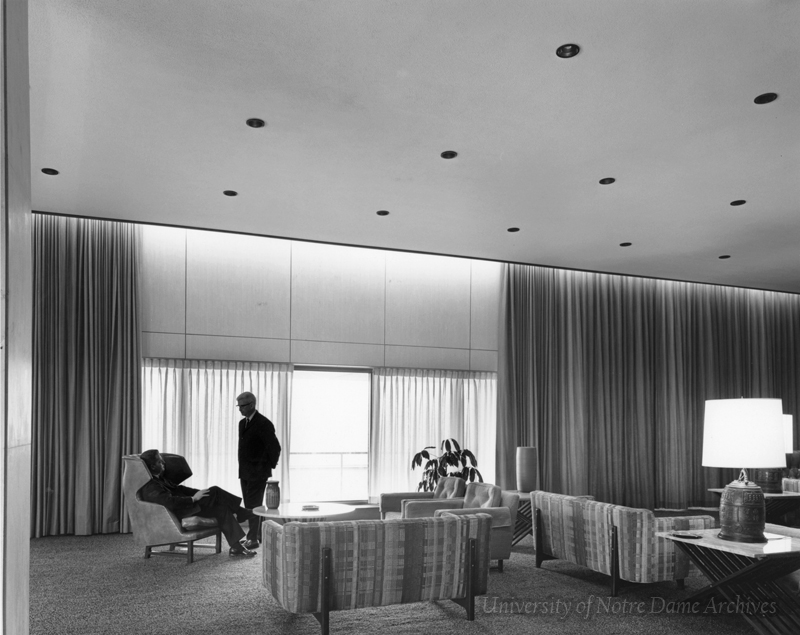
The interior of the Research Tower was largely brick and concrete, but rich oak, walnut, and polished, dark gray marble adorned the first two floors. Comfortable seating and central air system made for a pleasant, welcoming atmosphere conducive to study. The exterior of the first floor and its columns were covered in a tweed granite. The entire second floor was wrapped in a "multi-colored" buff brick, the warm tone found throughout campus. The 11 stories above were covered in a buff Mankato stone. Notre Dame Geologist, Erhard Winkler, described the stone used as "coarsely mottled and very porous with color variations ranging from buff to ochre brown." The 14th floor, which houses the penthouse for the president's use, is slightly narrower than the rest of the tower and is part large, precast concrete panels and part glass.
Source: University of Notre Dame Archives.
Memorial Library interior shortly before its opening, 1963.
Source: University of Notre Dame Archives.
Twenty simple drawings symbolizing Christ were engraved in much of the tweed granite surrounding the ground floor and painted gold. The artist, Warren Mossman, of Ellerbe and Co., who had designed the library, drew from the book Symbols of Christ, by Damasus Winzen, O.S.B. (1955). Winzen explains in the introduction to his book:
All the symbols explained in these pages represent the fullness of the salvation wrought by Christ. They are not limited to one particular aspect of the Lord's work. They comprehend the whole history of redemption, joining the beginning to the end. - binding together into a marvelous unity both the Old and the New Testament. - They embrace death and life, humility and glory.
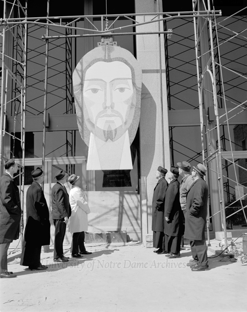
The symbols were meant to complement the mural of Christ to adorn the south side of the tower.
Word of Life Mural
Well before Memorial Library was built, Father Hesburgh had been inspired by a very different library while on a trip to Mexico. He visited the Central Library of the National Autonomous University (Universidad Nacional Autónoma de México, or UNAM), which was built about a decade before Memorial Library opened its doors. It was a smaller scale library, square and modern, covered in mosaic tile work, which depicted the ancient pagan past of its country. In 1910, UNAM split from the Church and became a public university in the name of academic freedom, whereas Father Hesburgh was convinced that Notre Dame's Catholic identity would not hinder academic freedom, but complement it. Father Hesburgh wanted to create something to counterbalance the mosaic in Mexico, and so conceived of the Word of Life mural.
Around the time the library plans were being drawn, Father Hesburgh shared his vision of a mural with Ellerbe and Co., which commissioned a gifted artist they had worked with before, Millard Sheets, of Claremont, California. The idea was that a massive mural would cover 11 stories of the tower above the library's main entrance.
In an interview, Sheets explained:
What they asked me to do was to suggest in a great processional the idea of a never-ending line of great scholars, thinkers, and teachers-saints that represented the best that man has recorded, and which are found represented in a library. The thought was that the various periods that are suggested in the theme have unfolded in the continuous process of one generation giving to the next. I put Christ at the top with the disciples to suggest that He is the great teacher-that is really the thematic idea.
Father Hesburgh pointed out in a speech years later,
It didn't take much encouragement to inspire Millard to share the vision. Artists are people of vision, and Millard was a wonderful artist in many media. ... I shared my concept with him knowing that we needed something spectacular to take this enormous building in the middle of a prairie in northern Indiana and not have it look like a grain elevator.
Sheets was skilled, indeed, in many areas. He was an architect and award-winning artist in a variety of media, including oil and watercolor, a talented muralist who had worked with paint, mosaic, and stained glass. He traveled and produced art all over the world. He mentioned at one point, speaking of creating the mural for the library, "It's one of the most exciting challenges an artist has ever had." He saw this work as a once-in-a-lifetime opportunity that he could not pass up. Former students of his from Scripps College and Chouinard would assist with the work; however, "all designs, explanatory sketches, and working guides are the product of Sheets' own hand."
Source: University of Notre Dame Archives.
As Sheets began planning and taking into consideration the climate in the Midwest and widely varying temperatures, he and the engineers on the project agreed that granite would be the ideal material for the mural. With the help of the Cold Spring Granite Company of Minnesota, Sheets spent over a year researching the various granites available around the world. He and his team gathered 143 stones from sixteen countries (including Europe and North and South America). Sheets researched saints and scholars in different periods throughout history, as well as each particular era's dress in order to accurately portray them in the mural. His daughter, Rev. Carolyn Sheets Owen Towle, spoke of him in 2003 as "a thorough student of history for every mural project, believing that the object of his work was as much to teach as to inspire."
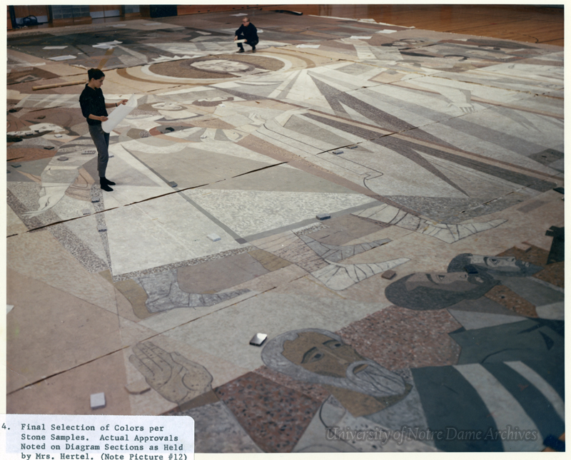
According to Pioneer Magazine, "By selecting different color shades and textures and by applying different types of finishes on the stone, the artist has been able to obtain a 'palette' and 171 muted color effects." Sheets sketched the mural on paper and then painted it using over 100 small granite samples of varying colors and finishes as a guide. He then used a projector to paint a full-size cartoon on paper in ten-foot sections, which he brought to Notre Dame for approval. Father Joyce, as director of the project, suggested they would need to stretch out the entire 132 ft x 65 ft cartoon on the ground and view from above. So, they arranged the sections of paper on a large, grassy field on campus and Father Joyce and Millard Sheets proceeded to carefully climb the nearby 90-foot water tower. The cold, winter wind and icy steps made for a challenging ascent, but they made it to the peak, only to discover they couldn't see the mural below and had to gingerly slide down the rounded tower to view it. Sheets' daughter, who had heard the story as a child, quipped, "I've always imagined that this must have been the world's most instantly approved project of art."
Once Sheets had approval to move forward, the Cold Spring Granite Company began cutting the stone into the many different shapes and sizes (from a few inches in diameter to several feet), nearly 7,000 pieces, all of varying thicknesses. Sheets even encouraged the company to attempt the unproven method of cutting granite on a curve (in which they succeeded). When the pieces were cut and fit together, facing down over a large, reversed cartoon, holes were drilled in the back and steel dowels were cemented in place. The arranged stones were grouped in large sections, which were then covered in a plastic material and then six inches of poured concrete. The plastic was placed between the granite and concrete in order to allow expansion and contraction in varying temperatures without affecting the stone. When set, the sections were turned over and grouted, and additional details were chiseled into the stone. Each finished concrete section was hoisted up the face of the library and secured against the Mankato stone with metal bolts and iron braces, but the process was concealed from curious onlookers. A large banner hung over the scaffolding during the work and then the finished product in order to save the big reveal for the library dedication day in May of 1964.
